
01 · Problem
A capable studio with a brand that undersold it.
The first brand book stopped describing the business as the company grew.
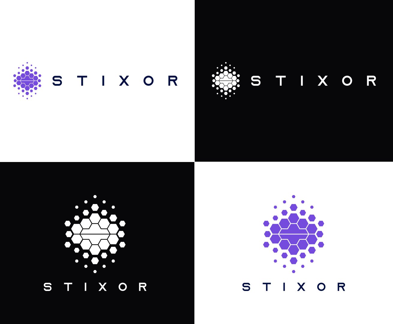
- A story out of step.It positioned a multi-industry studio as an AI legal platform.
- A category-default palette.Violet and navy on white, shared with countless SaaS brands.
- A voice without rules.Adjectives gave no guidance on writing a headline or an error message.
02 · Solution
Engineered Clarity.
Every decision follows one test: does it make Stixor clearer? The hexagonal mark kept its geometry, so recognition isn’t lost.

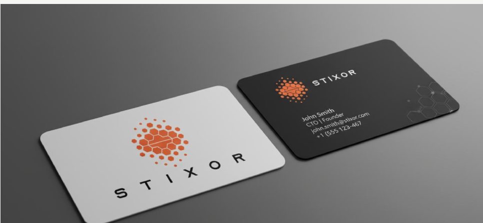
- Three colours with a job each.Charcoal 50, Ivory 40, Orange 10. Orange is never a background.
- Two type families.Helvetica Neue for structure, DM Mono for precision.
03 · Solution · Voice
We don’t just claim things work. We explain how.
Three pillars, with rewrites for the moments where tone matters most.
- Precise, not pedantic.“Automate your manual data entry with 99% accuracy.”
- Confident & direct.“Connection failed. Please check your network or refresh the page.”
- Human, but professional.“Welcome. Let’s get your workspace set up in three steps.”
04 · Results
Less noise. More signal. Same Stixor.
A brand that matches the work: calm, exact and recognisably its own, with rules simple enough for the whole team to use.
Next exhibit
UX audit · Mobile · EdTechA daily habit for 200,000 people, rebuilt around find and return.