HomeGet in touch

Exhibit A · Qur’an for AllUX audit · Mobile · EdTechShipped6 min read

A daily habit for 200,000 people, rebuilt around find and return.

* Re-tested on the shipped build eight weeks after release: same tasks, same protocol, against targets agreed before the first round of testing.

A free Islamic learning app with over 20,000 audio lectures and around 200K daily listeners in 90+ countries. I started with an audit nobody asked for, got hired to lead the redesign, and over eight months we shipped a new navigation, home screen and player.

Skip to the results Presentation (PDF)

Role
Lead product designer. I owned the strategy, the information architecture and the design system.
Team
Me and three juniors rotating across phases: two visual designers and one UX researcher.
Duration
8 months, from audit to handoff.
Platform
iOS and Android. Live on both stores.
Scale
200K daily users · 1M+ downloads · 90+ countries · 20K+ audio files.
Methods
UX audit, bilingual survey, moderated usability sessions, IA, UI, design system.
Qur’an for All redesign: Discover, Home and Favorite Series screens

At a glance

The 60-second version.

Problem
20,000 audio lectures sat behind 19 look-alike tiles, every daily feature was hidden in a three-dot menu, and the player, the screen people used most, was the lowest rated in the audit at 2.1/5.
Approach
A bilingual survey (around 1,900 responses) and six moderated sessions pointed to three intents: Find, Return and Explore. Those became a four-tab navigation, a Home that works as a personal dashboard, a proper player, a Library trimmed from 19 to 12 categories, and visible state on every row.
Hardest call
Deciding not to redesign the Library. Around 200,000 people had already memorised it, so it kept its shape and we only removed the categories the survey showed nobody used.
Outcome
Shipped on both stores, then re-tested on the same tasks. All six targets set before testing were met: saving an audio for later went from 0% completion to 92%, in 11 seconds.

01 · How it started

An audit nobody asked for.

A friend who studies at Al-Huda Institute mentioned that its app, Qur’an for All, felt outdated and hard to use. Nobody was asking me to do anything about it. I downloaded it anyway, spent some time with it, and put together a small UX audit on my own, mainly for my portfolio.

I sent it cold to the institute’s founder, without knowing anyone there. It was forwarded to the head of the IT team, who had already been thinking about a redesign. After a few conversations, they hired me to lead it.

02 · The problem

20,000 lectures behind look-alike tiles.

200K people open this app every day: some to find a specific lecture, some to continue a course they’re halfway through, some to discover something new. The app scattered its lectures across 19 categories drawn as twenty identical green tiles, hid the daily features in a three-dot menu, and once a lecture finally started, the player got in the way.

The challenge was to fix this without breaking the habits 200,000 people had already built.

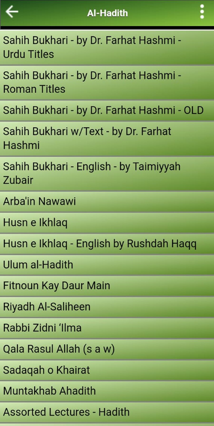
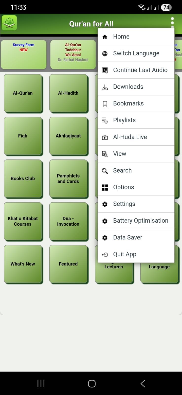
  1. Twenty identical tiles.No hierarchy, no grouping, no recency cues, and broad categories sitting beside single items.
  2. Daily features in a kebab menu.Search, Bookmarks, Downloads, Continue Last Audio and Settings, all behind one three-dot tap.
  3. No persistent navigation.Every move meant a trip back to the top-corner menu.
  4. A setting posing as a destination.“Switch Language” sat on the home grid as if it were content.
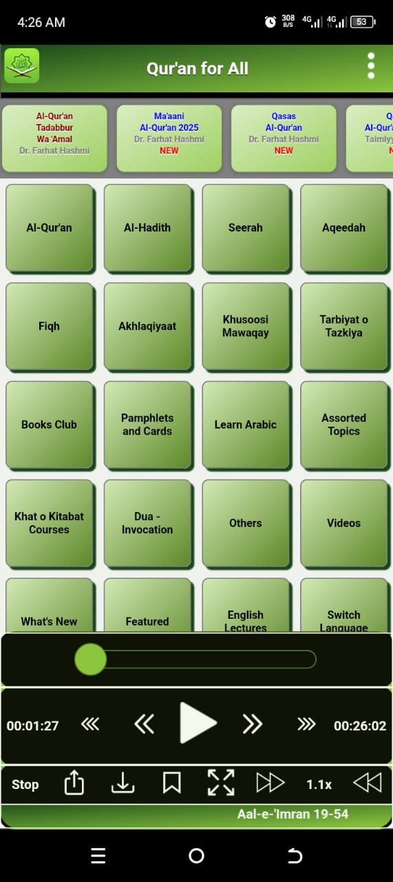
  5. Seven controls in one bar.Stop, share, download, bookmark, fullscreen, speed and an unlabelled slider in a single row.
  6. No state anywhere.No way to see what was saved, downloaded or already played.

03 · Research

What people said, and what they actually did.

I ran two tracks in parallel: a survey to learn how widespread the problems were, and moderated sessions to watch where the screens actually broke. The targets were agreed before either started.

Bilingual survey

~1,900
responses
3 weeks
collection window
55+
questions

A Google Form in English and Urdu, with roughly a 60/40 split in responses. It went out through the WhatsApp groups and Al-Huda channels where users were already active, plus an in-app banner.
Usability sessions

6
moderated sessions
45 min
cap per session
3
task groups

Remote, on users’ own devices, thinking aloud. Every task was measured on time, first-click success, error count, hesitation and a 1–5 ease rating.

Targets, set first

80%
task completion
≥70%
first-click success
≤1
error per task
≥4/5
ease rating

Agreed with the institute before the first round of testing, so the bar couldn’t move to fit the outcome.

04 · Findings

Users didn’t need new features. They needed the existing ones to work better.

Three intents kept surfacing across the survey and the sessions. An intent is the reason someone opens the app: the job they need it to do in that moment.

Find

55%
never used Search, because it was hidden

They already know what they want: a scholar, a topic, a title they remember. The job is retrieval, the shortest path from Home to one lecture.

Return

60%
had saved something they later couldn’t find

They’re in the middle of something: a series started weeks ago, a lecture paused on a commute. The job is to resume, not to re-pick.

Explore

Smallest
segment by far

No particular goal. Stakeholders chose to prioritise current users over new ones, and the research pointed the same way. Find and Return are where the redesign focused.

Three actions carried the daily habitSelf-reported use, survey, n≈1,900
  • Playback88%
  • Downloads71%
  • Favorites54%
Baseline task log, from two of the six sessions
TaskParticipantTimeOutcome
Bookmark a Surah to listen laterP1 · daily user, 7 months120s Failed
Find your bookmarked SurahsP2 · new user1m 25s Confused
Check if a Surah is already savedP1 and P2 · 0 of 2— Failed
Seek to 30 minutes into a lectureP140s · 4 errors Failed
Download a lecture for offline useP2 · first attempt3 min Completed

Everything is excellent, the content changes lives. The interface is what holds it back.

Survey response, long-time user

05 · Decisions

Six decisions, each traced to a finding.

  1. Give the app navigation.

    Finding
    37% of survey respondents skipped the top feature bar entirely and 55% never used Search. The structure was failing every kind of user before any intent-specific problem could surface.
    Decision
    A four-tab bar, visible on every screen, replaced the kebab. Each tab maps to one behaviour: Home is your activity, Browse is discovery, Library is structured content, Search is direct retrieval.
    BeforeOld kebab menu with Bookmarks, Search and Downloads
    Every daily feature behind one tap
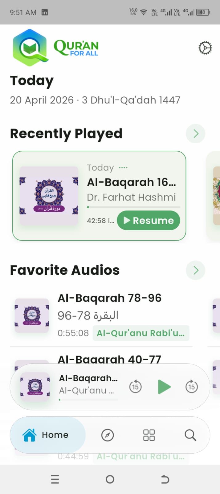
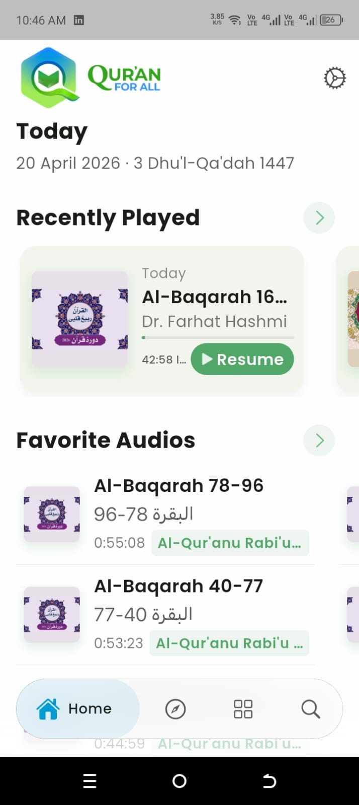
    AfterNew home: populated dashboard with persistent four-tab navigation
    Four tabs and a populated Home
  2. Hardest call: don’t redesign the Library.

    Finding
    The Library was the screen 200,000 daily users had already learned. Anything that forced them to re-learn it was off the table.
    Decision
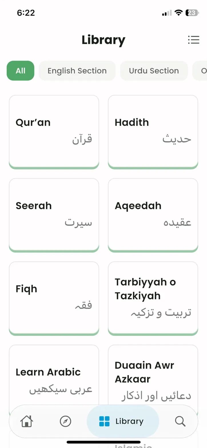
    It kept its shape. Twenty identical tiles became 12 cards, keeping what the survey showed people used and cutting the rest, from 19 categories to 12. English and Urdu filters mean an Urdu-only listener never scrolls past English titles.
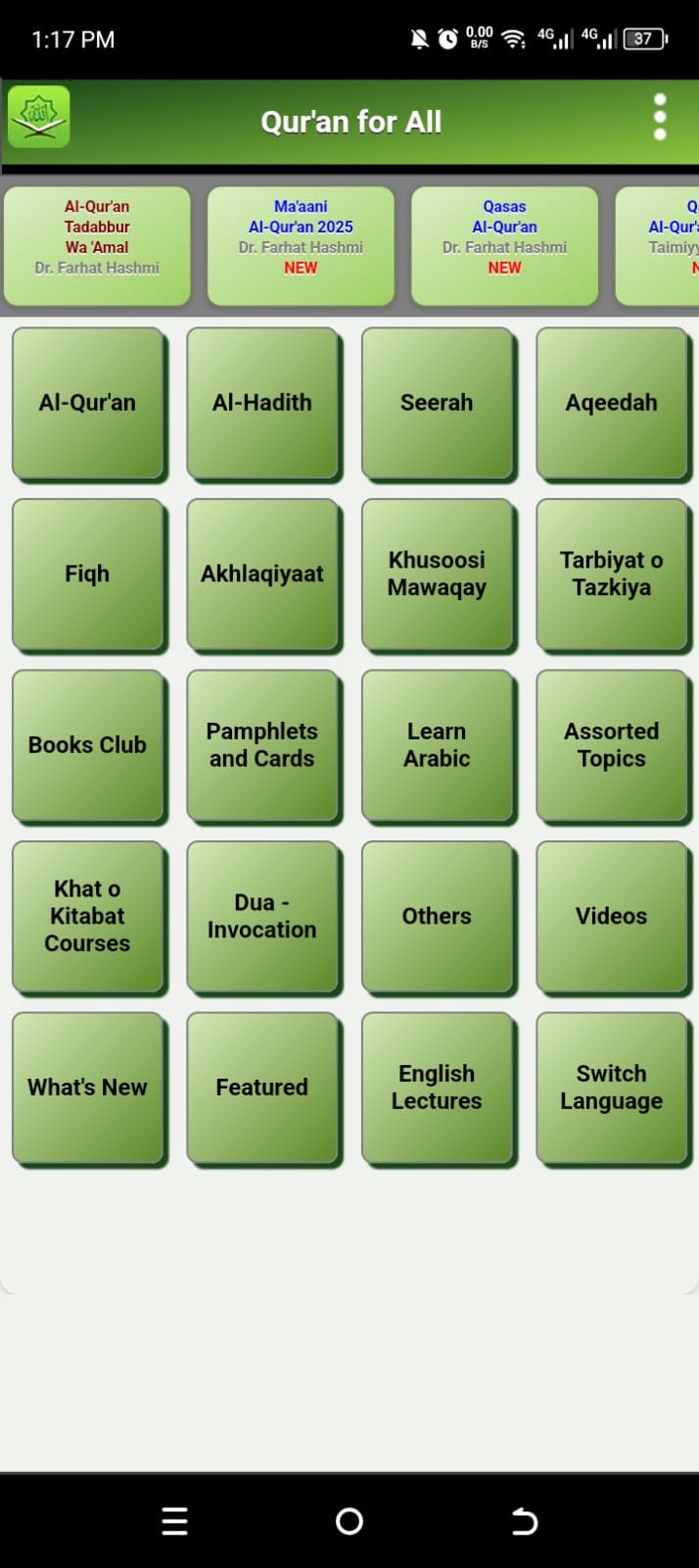
    BeforeOld home screen: 20 green tiles
    The Library was the home screen
    AfterLibrary: 12 cards in the All filter
    Same shape, 12 cards, language filters
  3. One taxonomy rule for 20,000+ files.

    Finding
    Variants, duplicates and OLD entries sat at the same level as named series, in every folder. And thousands of folders had to be re-labelled by the institute’s small IT team, which ruled out a bespoke tree.
    Decision
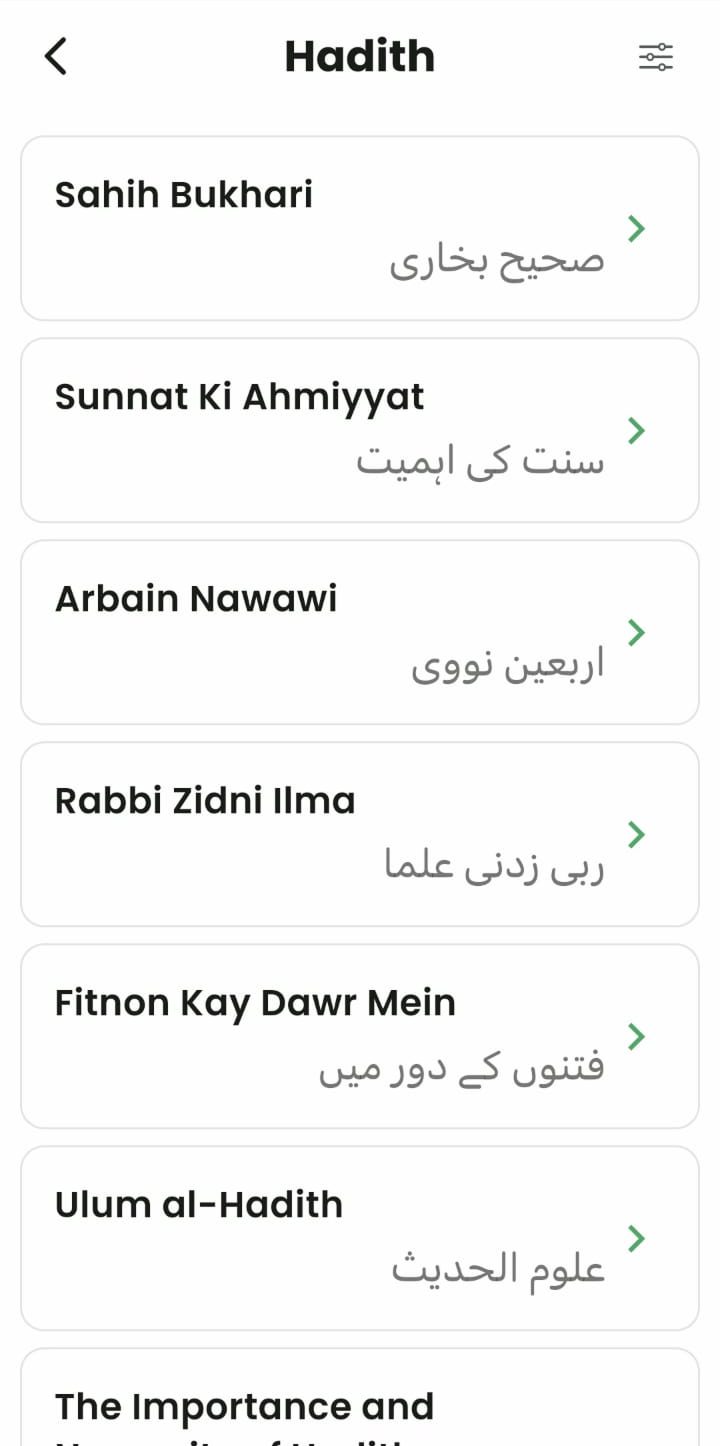
    One repeatable rule that someone else could apply at scale: one row per series, language and version variants one tap deeper, bilingual titles on every row, dead OLD entries removed.
    BeforeOld Al-Hadith list with Urdu, Roman and OLD variants as separate rows
    Variants and courses flat at one level
    AfterNew Hadith list with English and Urdu titles
    One title per row, bilingual labels
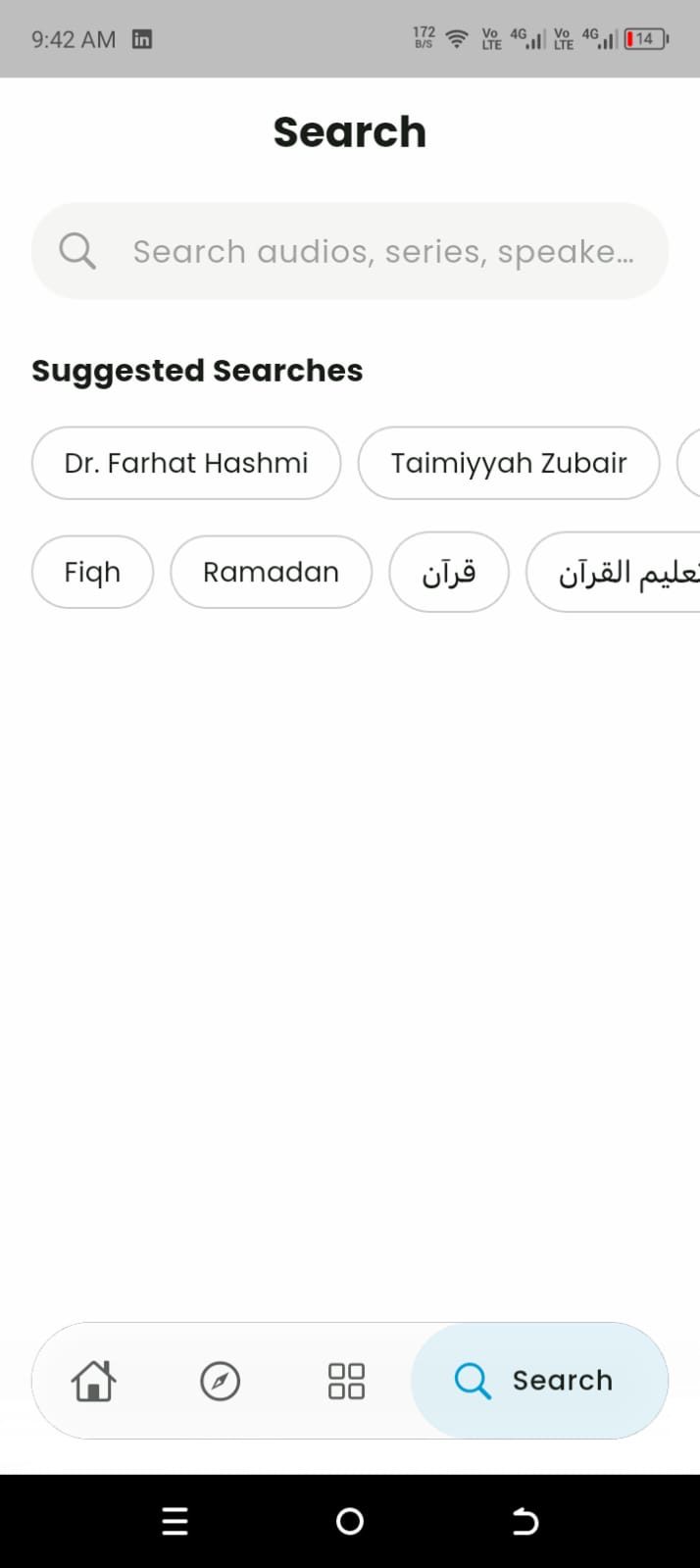
  4. Make Search a tab.

    Finding
    55% never used Search, but that didn’t mean they didn’t want it. “Please make the search option easier, searching a topic is very difficult,” one response said, translated from Urdu. People had been finding lectures by asking peers and teachers instead.
    Decision
    Search moved into the tab bar, one tap from every screen, with suggested speakers and topics before you type.
    AfterNew Search tab with suggested speakers and topics
    A dedicated tab, with suggestions before you type
  5. One way to save, and state you can see.

    Finding
    60% had saved something they later couldn’t find. Bookmarks (21%) and Favorites (54%) were two features doing the same job, and no row showed whether it was saved, downloaded or already played.
    Decision
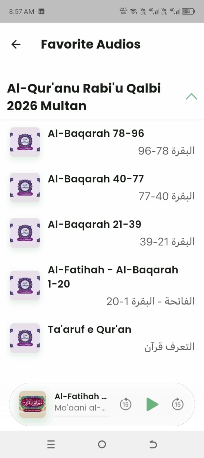
    Bookmarks was removed. Home became a dashboard of four rows: Recently Played, Favorite Audios, Favorite Series and Downloaded, each opening its own manager. Every audio row now shows its state.
    AfterFavorite Audios manager, grouped by series
    Favorite Audios, grouped by series
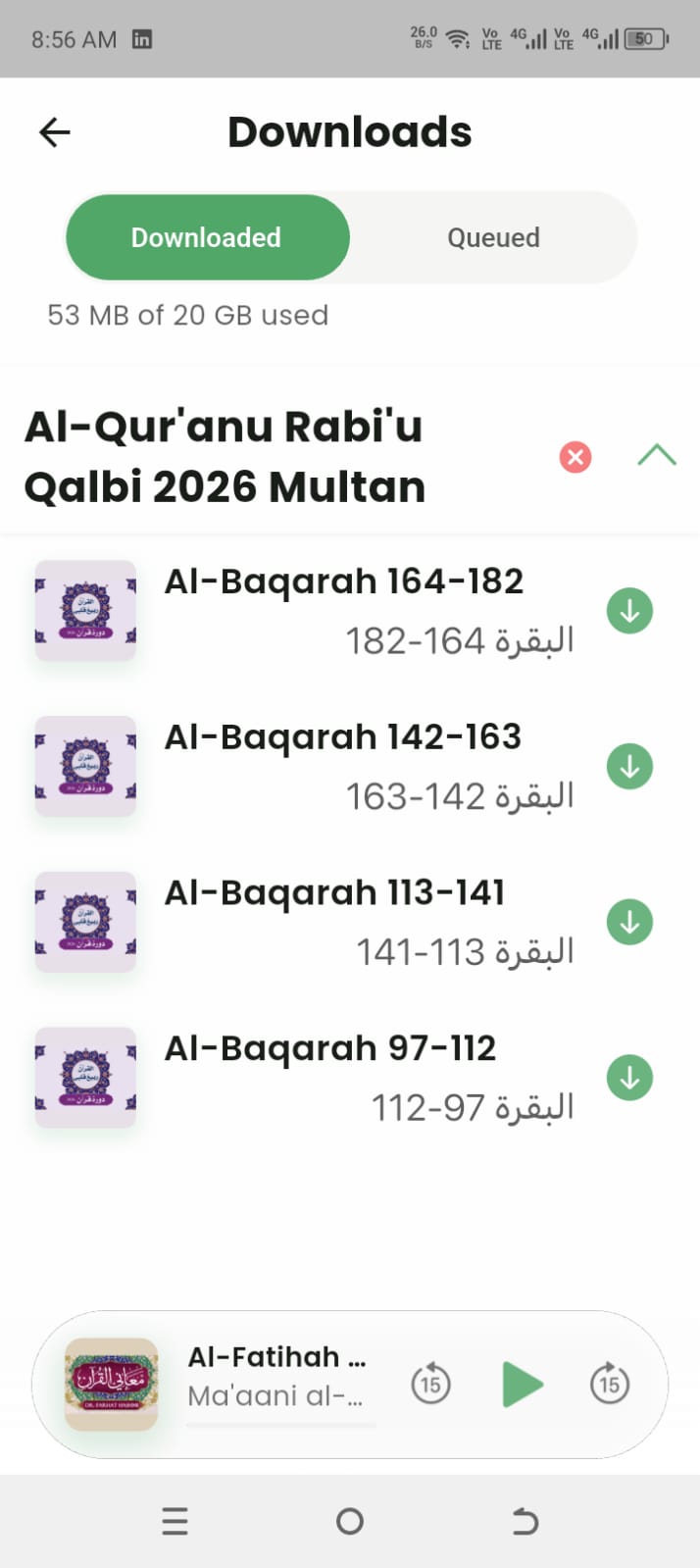
    AfterDownloads manager with Downloaded and Queued tabs, storage used and a green check per track
    Downloads: storage up top, a green check per track
  6. Rebuild playback as two surfaces.

    Finding
    Playback was the most used task and the lowest rated, at 2.1 out of 5. P1 scrubbed to the wrong position four times, and P2 couldn’t find the speed control.
    Decision
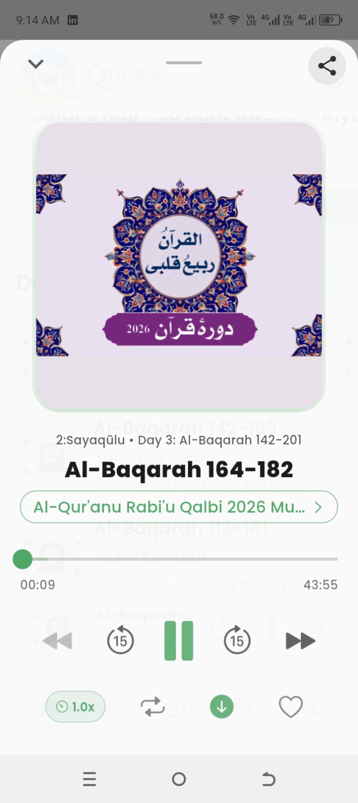
    A persistent mini player with three controls for the background, and a full-screen player with a real scrub bar and exposed speed control for everything else.
    BeforeOld playback bar with seven controls crammed together
    A control strip jammed over the grid
    AfterNew mini player pinned above the tab bar
    Mini player, persistent
    AfterNew full-screen player with a scrub bar
    Full-screen player, real scrub bar

06 · Results

Shipped, then re-tested on the same tasks.

The redesign is live on both stores. Eight weeks after release I re-ran the same task set, with the same moderated protocol, against the shipped build. So these numbers were measured the same way the original problems were.

Results against the targets agreed before testing
TaskBaseline (old app)TargetPost-launchResult
Save an audio to listen later0% · 120s, abandoned≥80% complete92% · 11s Met
Find something you saved1m 25s · confused≥80% complete96% · 9s Met
Tell whether an audio is already saved0% first-click≥70% first-click88% first-click Met
Seek to 30 minutes into a lecture4.0 errors · failed≤1 error0.3 errors Met
Download for offline use3m 00s · completed≤1 error0.2 errors · 34s Met
Player ease (1–5)2.1 / 5≥4 / 54.5 / 5 Met

What shipped

  • A persistent four-tab navigation (Home, Browse, Library, Search) replacing the kebab menu.
  • Home rebuilt as a personal dashboard: Recently Played, Favorite Audios, Favorite Series and Downloaded, each with its own manager.
  • Playback as two surfaces: a persistent mini player and a full-screen player with a real scrub bar and exposed speed control.
  • Library trimmed from 19 to 12 categories, with English and Urdu subsets.
  • One taxonomy rule applied across 20,000+ files.
  • A single save model, with visible state on every row.
  • A skippable eight-screen first run, and a design system the two junior designers could apply without me.

07 · Constraints

What shaped the design.

  1. No re-learning budget.Anything that forced 200K daily users to re-learn the Library was off the table, so the new structure is additive and the old shape survives inside it.
  2. No usage data.No analytics, no funnels and no category-level traffic until the survey existed.
  3. Content operations.Thousands of folders had to be re-labelled by a small IT team, which pushed me to one repeatable rule per row.
  4. A rotating junior team.Two visual designers and one researcher moved in and out across phases, so the system had to stay small enough to run without me in the room.
  5. Current users first.A stakeholder call. New-user discovery came from teachers and senior staff rather than from user data.
  6. Accessibility deferred.Font scale, contrast and screen-reader labels did not make the first release. For an audience that skews older and reads in two scripts, that’s the gap I would close first.

08 · Learnings

Good judgment sometimes means doing less design.

  1. The hardest call was holding back.Letting Browse and Library coexist, so 200,000 daily users kept the shape they knew while we introduced something new, was harder than designing either one.
  2. Showing state mattered more than adding actions.The app already worked. It just never showed you that it had worked. The tasks that improved most were the ones where the fix was making things visible.
  3. A redesign isn’t the end of the work.Hitting targets in a session room isn’t the same as hitting them across 90 countries. The next cycle has two goals: analytics in the product, and closing the accessibility gaps that didn’t make the first release.

Next exhibit

AI trust · LegalTechMaking a legal AI show its sources, down to the article.